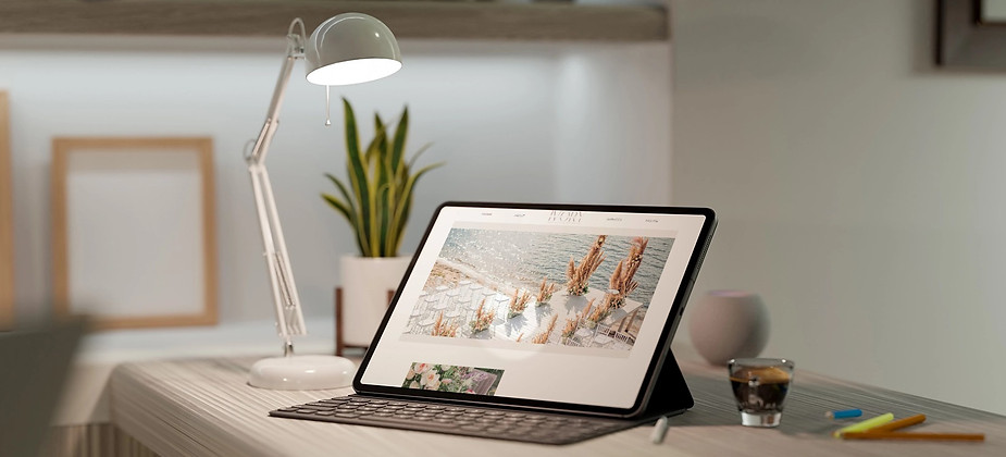
Website Design
Creative Artifact 1
WildQueen Creative
WildQueen Creative was the spark. It began not just as a brand, but as a reclamation of voice. The website design and brand system were created as an experiment in shaping identity through digital space: strategy, layout, and narrative executed without compromise. The structure challenged conventional UX with minimal navigation, no CTAs, and an aesthetic that leans more altar than agency.
The build focused on control and clarity. Clean grid logic meets curated disorder: ink textures, lunar symbolism, and bold serif type play against open white space and soft body copy. This site set the tone for how WildQueen would show up across platforms: with confidence, intention, and no apology.
The site doesn't persuade — it anchors.
Every design choice reinforces the brand's ability to stand without explanation: confident in its tone, intentional in its silence, and unmistakably present.
.jpeg)


Creative Artifact 2
Ivory Collective Events is a luxury wedding and event brand built for high-profile clients. The brand was crafted to reflect beauty in motion and timeless elegance. From the earliest moodboards, every visual decision was grounded in emotion, texture, and flow. The identity began with client “ID” discovery work, then evolved into a refined logo and palette that matched their company mission.
The design system balances softness with precision: muted neutrals, romantic light, and delicate contrast working together to hold space for both opulence and warmth. Every detail was considered to support not just aesthetic harmony, but emotional impact. Since launch, Ivory Collective has carried that energy through multiple luxury events, each one a fully lived-in reflection of the brand’s promise.
This brand system was designed for longevity and emotional precision.
Every visual element was built to scale — elegant enough for intimate moments, structured enough for high-end execution.
Creative Artifact 3
JINGOLI Nuclear provides specialized services for nuclear plant projects across planning, construction, commissioning, and decommissioning. The goal of the website was to establish a clear, credible digital presence that could support the technical depth and pace of the company’s work.
The brand system was designed to communicate strength, precision, and experience. Typography choices were direct and legible, paired with a high-contrast color palette anchored in red to reflect urgency and leadership. The layout emphasizes structured navigation, project hierarchy, and clarity of services, all built to align with the expectations of industry stakeholders. Messaging was kept sharp and informational, with a design that prioritizes trust and decisiveness over visual flourish.
This platform was designed to communicate trust at a glance. It is structure supports high-value contracts, complex project navigation, and a brand identity built on capability, not flash.


Contact
Location
971 US Highway 202 N. Suite N,
Branchburg, New Jersey 08876